Case Study : Everywhere
Founded in 2007, Everywhere was the first experiential travel magazine of its kind. Based on a unique model of user-contributed content, all articles and photographs were submitted by members of the Everywhere community. The top-voted stories from the website would then be featured in the bi-monthly print edition.
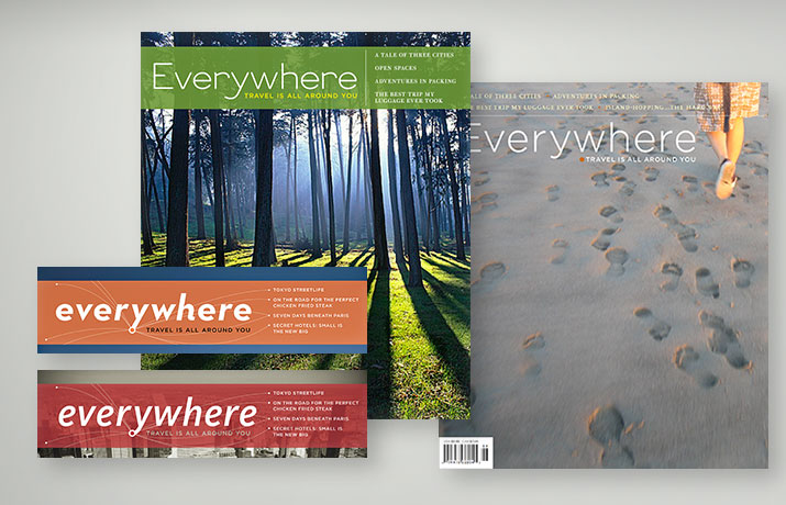
Cover Banner studies: One of the main objectives in designing the cover, was to consolidate the cover lines into a prescribed area so as to feature the cover photography by obscuring it as little as possible with type. In order to achieve that effectivley—preserving legibility—a translucent color band is used to contain the banner, tagline, and cover lines. Inspired by flight destination maps, a graphic was created to tie the banner and the cover lines together, and form a unique logotype for the magazine's identity.
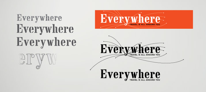
Logotype: Preliminary sketches showing alterations to an existing typeface. A counter (hole) was made in the ball terminal in the descender of the "y" to act as the center-point of the flightlines. Additionally, several of the negative spaces in the stenciling of certain letters were either narrowed or filled in to enhance legibility and create unique forms.
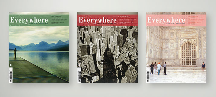
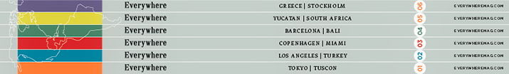
Issue Color System: Each bi-monthly issue is associated with a distinct color for the band, which is also used in the interior for certain graphic and typographic elements. The band wraps to the spine, combined with line art that eventually forms a world map when consecutive issues are stacked together.
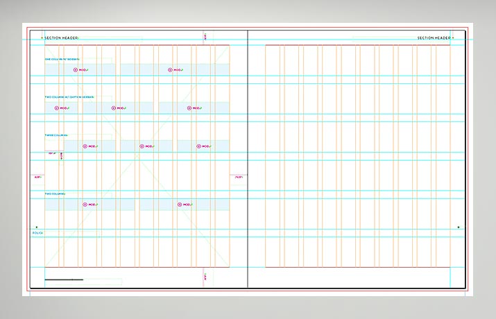
Grid: A ten module/column grid is utilized to provide flexibility in creating both symmetric and asymmetric layouts for all sections of the magazine. The flightline motif is incorporated in to the running heads of the various sections.


Typography: (top) Two versions of a front-of-book story. The serif typeface is Fedra, and Whitney is the predominant sans-serif face. (bottom) Each issue features several Trip spreads that are laid out with reference to a cartographic-style grid.

Feature Opener: A spread indicating both the two geographic places and two themes for each issue, help to divide the front-matter from the feature well of the magazine.
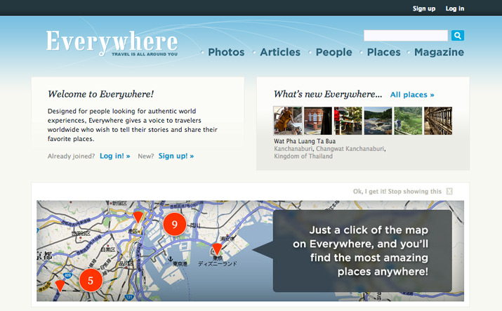
Website: This intro/sign-in page is an example of how the visual design language has been applied and expanded to provide a cohesive the online experience.